The Ultimate UX/UI Guide to Printcart Online Product Designer for Web2Print & WooCommerce Stores
Boost conversions and reduce support tickets with this complete UX/UI tutorial for the Printcart Online Designer. Learn how to optimize layout modes, editable fields, mobile flows, 3D previews, and branding settings to create the best Web2Print customization experience for WooCommerce and beyond.
- By Netbase
- 3 views
- 0 reply

Netbase
This quote has stayed with me throughout my journey—especially as I built Printcart from the ground up "What doesn’t kill you makes you stronger."
This quote has stayed with me throughout my journey—especially as I built Printcart from the ground up.
I'm David, CEO of Printcart, a division of Netbase JSC, and I’ve dedicated the past 15 years to transforming the Web-to-Print and Print-on-Demand (POD) industry. My goal from the beginning has been clear: to help printing businesses around the world scale through automation, personalization, and smart technology.
Before Printcart, I spent years consulting and launching web-to-print platforms for printers of all sizes—from local shops to global enterprises. That experience taught me to ask the right questions:
How can we reduce manual steps for printers and let them focus on growth?
What tools do customers need to personalize and place their orders effortlessly?
How can we make the Web2Print journey smoother, faster, and more profitable?
At Printcart, we combine AI, cloud-based automation, and a plug-and-play customization engine to bring that vision to life. But more than features, we care about outcomes—helping our clients deliver better user experiences, close more deals, and scale sustainably.
I’m always open to new ideas and feedback from the community. If you’re exploring how to evolve your print business or launch a new eCommerce venture with Web2Print capabilities, feel free to connect directly.
Let’s talk growth.
? Email: project@printcart.com
? Website: https://printcart.com ...
Related Post
Introduction: What Is a Designer-to-Printer Marketplace? Why the Teespring Business Model Works A designer-to-printer marketplace is a platform where creatives can upload artwork and sell it on print products (like t-shirts,...
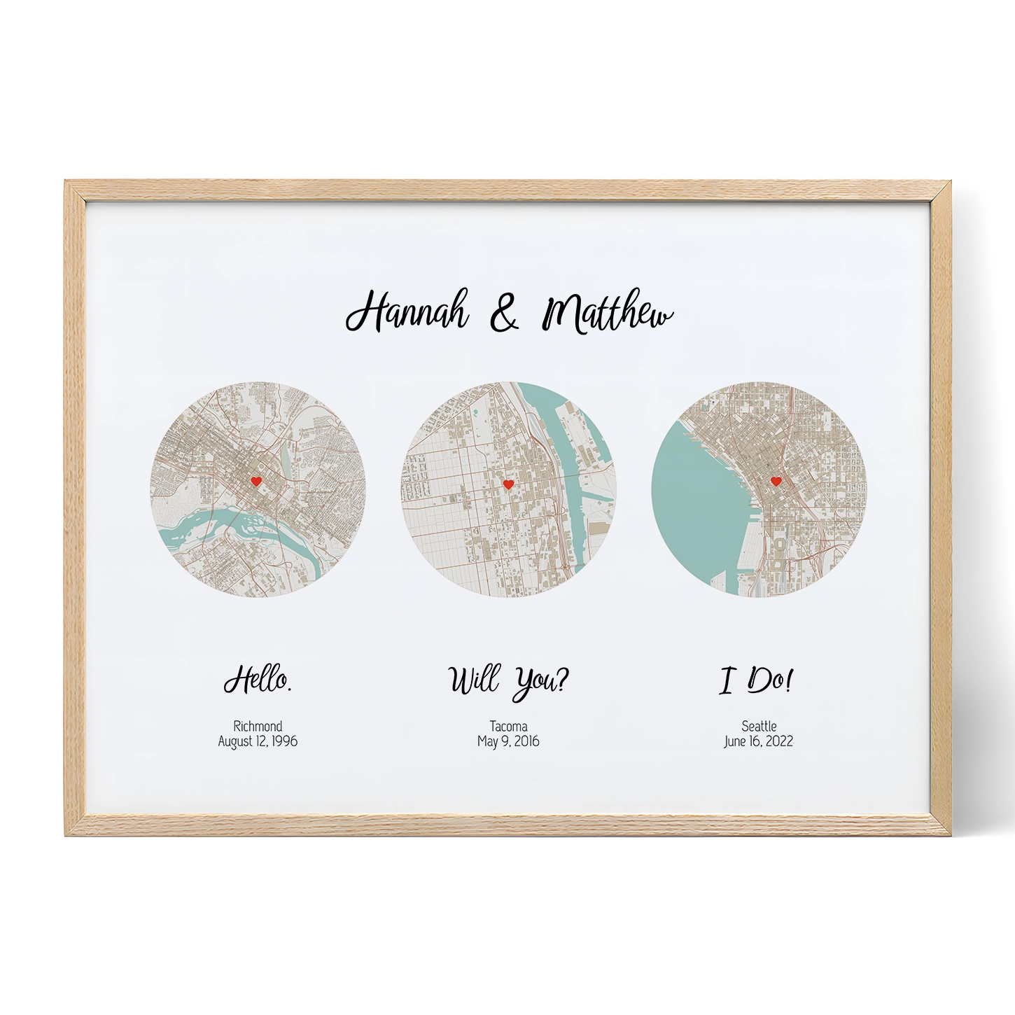
The Art of Personalization Capturing the Essence of Your Love Story: A Personalized Journey Finding unique and meaningful gifts can be challenging, especially when trying to capture personal love stories...
Why Design Templates Matter in Web2Print Workflow For print shop owners scaling product catalogs across packaging, signage, apparel, and business stationery—design templates are a game-changer. Instead of recreating print zones from...
Other Usefull Contents
You can see many success stories from our customers, and you may be one of them in the future









Introduction to Online Designer UX for Print Stores
What is an online product designer in Web2Print?
An online product designer is a web-based customization interface that allows customers to personalize print products—like business cards, t-shirts, mugs, packaging, and more—directly on a print store's website. Unlike static order forms or manual design uploads, this tool offers an interactive canvas, letting users add text, upload images, adjust layouts, and preview their final product in real time.
In the context of Web2Print, this functionality powers scalable print-on-demand and custom order workflows, giving customers full control over their design without involving customer support or third-party design tools. The result: faster order completion, higher satisfaction, and fewer errors.
Why UX/UI is critical for customer satisfaction and conversions
While offering design functionality is essential, what truly drives conversion is the user experience (UX) and user interface (UI) behind the tool. A clunky interface, confusing buttons, or laggy editor can lead to high cart abandonment and customer frustration.
A well-optimized Online Designer should:
Be intuitive for non-designers
Work smoothly across devices (desktop, tablet, mobile)
Offer live previews with bleed/safe zone visibility
Provide fast, guided entry points like “Start Design” buttons
Require minimal loading or redirects
How Printcart Online Designer improves user flow and design accuracy
Printcart’s Online Designer plugin for WooCommerce and other platforms is built specifically for print-specific UX. It addresses the typical pain points found in generic design tools by offering:
Multiple layout modes (Modern, Classic, Visual) tailored to the type of product or user
Editable template fields that reduce friction in personalization
Built-in tools for 3D preview, bleed area warnings, and DPI resolution checks
Mobile-first UI that adapts across devices
Seamless connection to print file exports, quotes, and cloud workflows
If you're new to Printcart, explore the official Printcart Online Designer demo to experience the interface.
For deeper platform integration tutorials, check out this WooCommerce designer setup guide.
Next, we’ll explore the layout modes available in Printcart and how each one impacts UX.
Exploring Online Designer Layout Options
Modern vs Classic vs Visual layouts: UX comparison
Printcart provides three distinct layout modes for its Online Designer tool: Modern, Classic, and Visual. Each layout is designed with a specific user profile and product experience in mind, allowing you to tailor the editor's interface to your audience.
Modern Layout: This is the default and most mobile-optimized interface. It features a clean design, collapsible sidebars, and intuitive navigation. Ideal for consumer-facing products like mugs, t-shirts, or photobooks.
Classic Layout: This layout offers a more traditional panel-based interface, better suited for returning users or legacy customers who prefer a familiar structure.
Visual Layout: A graphic-focused interface emphasizing thumbnails and preview visuals. Perfect for template-driven products such as cards, signs, and packaging with graphical backgrounds.
Choosing the best layout for your product and audience
Your layout choice should reflect your user’s technical comfort level, device type, and the product’s design complexity. Here's a quick guide:
Use Modern Layout for mobile shoppers, casual users, and products with simple personalization (e.g., apparel, mugs)
Use Visual Layout for products that rely heavily on pre-built templates or gallery browsing (e.g., posters, packaging)
Use Classic Layout for B2B or repeat customers who value detail control over interface modernity (e.g., stationery, flyers)
Each layout can be activated per product via the Printcart plugin’s backend. Learn more about layout activation in the Printcart WooCommerce plugin guide.
Live demo links for layout exploration and testing
Explore each layout in a live store environment:
Modern Layout Demo
Classic Layout Demo
Visual Layout Demo
Next, we’ll walk through the Printcart Online Designer interface—toolbars, canvases, and real-time editing UX.
Understanding the Printcart Online Designer Interface
Toolbar, canvas, and side panel UX explained
A great user experience begins with how quickly customers understand and navigate the design editor. The Printcart Online Designer interface is built with UX clarity in mind, dividing the workspace into three main components:
Toolbar: This includes tools like text, image, shape, QR code, layers, and undo/redo. The layout is customizable, letting you enable or hide specific tools depending on your product.
Design Canvas: This is the real-time preview area where users edit the product. It visually reflects changes instantly—like color, size, font, or position.
Side Panel (Tabs): Here users can switch between design layers, template selections, typography settings, clipart libraries, or saved projects.
Real-time feedback, design layers, and controls
The Printcart interface prioritizes real-time interaction. Every element placed on the canvas is treated as a layer—similar to Photoshop or Canva—allowing users to:
Reorder layers (bring to front/back)
Lock/unlock and hide individual layers
Align, scale, or rotate elements with snapping support
The inclusion of grid lines, rulers, and layer dimensions (enabled via Appearance settings) dramatically improves control over layout precision, especially for professional customers.
UI settings for safe zone, bleed line, and resolution alerts
Printcart includes print-critical UX features built into the editor interface:
Safe Zone & Bleed Lines: Help users keep vital text and logos within printable bounds. These lines can be toggled in Appearance settings.
DPI & Resolution Warnings: Alert users when an uploaded image falls below the set DPI threshold (e.g., 300 DPI for print).
Out-of-Bounds Alerts: If an object is dragged outside the safe zone or design area, the user sees a warning tooltip.
These tools reduce production errors and ensure professional print results—even for first-time users.
You can customize these features in the Appearance > Modern Layout settings. For more detail, visit the official Printcart plugin appearance guide.
Next, we’ll explore how editable template fields can streamline the user experience and improve personalization workflows.
Using Editable Template Fields for Smarter UX
What are editable fields and how do they improve usability?
Editable template fields in Printcart allow store owners to define specific, structured zones on a product where users can enter text, upload images, or choose predefined options. These fields are not just decorative—they guide users through the personalization process, ensuring consistency and reducing confusion.
Instead of starting from a blank canvas, users can simply click into fields like:
Name, Company, or Tagline on a business card
Upload your logo here for branded packaging
Change image on a personalized mug or photobook
This enhances UX by:
Reducing cognitive load for non-designers
Limiting editable zones to what’s relevant for the product
Ensuring layout consistency, which is critical in print production
Addable field types: text, image, dropdown, QR code
Printcart supports a variety of field types to suit different product needs:
Text Fields: For name, message, slogan, title, etc.
Image Fields: Users can upload logos, headshots, or photos
Dropdown Menus: Let users choose predefined values (e.g., job titles, color variants)
QR Code Fields: Customers can auto-generate a QR that links to a website, contact, or vCard
All of these can be locked, repositioned, grouped, or layered with custom fonts, shapes, and icons. You can also assign placeholder content and tooltips for added guidance.
Field placement strategy and user guidance UX
An effective editable field UX relies on intentional field layout:
Group editable fields visually (e.g., all text on left, all images on right)
Use lock and visibility icons to hide non-editable layers
Apply consistent fonts, colors, and sizing in template defaults
Use tooltips or overlay text like "Click here to edit name" to provide subtle instructions
This structure streamlines the flow and prevents users from feeling overwhelmed.
To learn how to implement template fields, visit the Printcart Template Mapping Guide.
Next, we’ll explore how 3D previews enhance the product design experience and build buyer confidence.
3D Preview Experience: UX Design in Product Customization
How 3D previews enhance confidence and reduce returns
One of the most powerful UX features in the Printcart Online Designer is the 3D product preview. Unlike traditional flat design previews, a 3D preview lets users see their customized product from multiple angles—creating a stronger sense of ownership, trust, and purchase intent.
Why this matters:
Users visualize exactly how the final printed object will look
Reduces the fear of making a mistake or ordering something that doesn’t meet expectations
Decreases support requests and refund rates
3D previews are especially impactful for:
Mugs (viewing the full wraparound)
T-shirts and apparel (front, back, sleeves)
Packaging (boxes, cartons, labels)
3D interface navigation and performance considerations
Printcart’s 3D viewer integrates seamlessly within the editor. Once the design is complete, users can toggle to the 3D tab to see a realistic render.
The viewer includes:
Zoom and rotate controls
Live texture rendering of the actual uploaded design
Automatic mapping of layers onto product mockups
Performance tips:
Use optimized 3D models in
.objor.glbformatsEnable server-side caching for repeat previews
Keep design area within logical boundaries to avoid misalignment
Admins can configure product-specific 3D models via the plugin backend. Learn how in the Printcart 3D setup guide.
UX tips for 3D use on packaging, mugs, and apparel
Here are specific recommendations for ensuring 3D previews enhance rather than complicate UX:
Delay 3D toggle until after the first save or complete design to avoid loading a blank model
Include a "View in 3D" button that clearly indicates it's a preview mode
Use hover hints like "Drag to rotate" or "Click to zoom"
Allow easy switch back to the 2D editor
Provide fallback static preview for older browsers or slower networks
You can preview a working example using this Printcart 3D demo.
Next, we’ll dive into how customers upload their own artwork and how to optimize the upload UX for print readiness.
Upload Design UX in the Online Designer
Uploading professional files (AI, PDF, SVG, PSD, etc.)
The upload design feature in the Printcart Online Designer allows customers to submit their own artwork directly into the customization interface. This is essential for B2B clients, designers, or returning customers who prefer to upload ready-made designs instead of using templates or editor tools.
Printcart supports professional file types such as .jpg, .png, .svg, .pdf, .ai, .psd, .eps, and more. These can be configured via the backend under the Upload Design tab in plugin settings.
Admins can:
Restrict or allow specific file extensions
Set max file size (e.g., 100MB)
Enable or disable preview generation for large uploads
DPI warnings, file size limits, and auto-validation
For print-ready quality, Printcart includes several UX-focused safeguards:
Minimum DPI setting: Default is 300 DPI for print, but can be changed depending on product type
Image resolution alerts: If a user uploads a low-res file, the editor displays a real-time warning ("Image quality may appear pixelated when printed")
Max file upload control: Prevent server overload by limiting upload count per session
Tooltips: Appear near the upload button to inform users of format or size requirements
You can configure these settings in PC Designer > Upload Design > Upload Settings. Detailed setup instructions are available in the Upload File Integration Guide.
Upload tool layout and real-time preview UX
The upload area is embedded within the sidebar or modal popup (based on layout settings). Once uploaded, the image appears directly on the canvas, where users can:
Resize, rotate, and align their uploaded file
Add layers and text over it
Preview in 3D mode if applicable
To improve UX:
Enable preview generation for instant visual feedback
Use drag-and-drop interface for casual users
Integrate with third-party platforms like Facebook, Instagram, Google Drive, and Dropbox to allow cloud uploads
Next, we’ll review mobile UX strategies for customizing products on smartphones and tablets.
Mobile UX for Product Customization
Responsive layout adjustments for smaller screens
Designing on mobile presents unique UX challenges due to limited screen space and touch-based interaction. The Printcart Online Designer has been optimized to ensure fluid performance and accessibility on both smartphones and tablets.
Key layout adjustments include:
Auto-collapsing toolbars to preserve canvas space
Scrollable side panels with swipe gestures
Touch-friendly icons and padding to prevent misclicks
Full compatibility with Safari, Chrome, and Android webview
These optimizations ensure that even users designing a business card or uploading artwork on a phone can complete orders without frustration.
UX design for mobile-first product personalization
Many first-time users begin their customization journey on mobile. To support this:
Simplify the UI: Hide advanced tabs (e.g., typography, layers) unless activated manually
Pre-load templates with editable zones so users don’t have to start from scratch
Use large tap targets and sticky buttons like "Start Design" or "Add Image"
Display context-aware modals (e.g., "Upload Logo" or "Change Background")
For WooCommerce sites, make sure the "Start Design" button and preview elements scale correctly across responsive themes. Use relative units (%, em) in custom CSS, and test across multiple devices.
Case: Designing phone cases or t-shirts on mobile
When users design high-visual products like phone cases, t-shirts, or photobooks:
Present a single-side editor at first (e.g., front view only)
Delay optional tabs like "Back" or "Inside" until user requests
Use overlay text like "Tap to edit name" or "Upload your photo here"
Include preview thumbnails after each step to keep users engaged
This step-by-step simplification reduces bounce rates and makes the creative process feel rewarding.
Explore this behavior in action with the Printcart Mobile Designer Demo.
Next, we’ll look at ways to optimize the visibility and flow of the Start Design CTA across product pages.
Optimizing the Start Design Experience
Button placement and behavior: before vs after product options
The "Start Design" button is the most critical UX trigger in the online customization journey. Poor positioning or delayed visibility can cause confusion and drop-offs. Printcart gives you control over where and how this button appears on product pages.
Best UX practices for placement:
Before product variations: Ideal for quick customization products like mugs or stickers
After selecting options: Useful when size, material, or quantity should be selected first (e.g., for apparel or signage)
Floating sticky bar: Keeps the action visible during scrolling, especially on mobile
In Printcart, you can adjust this under:
PC Designer > Appearance > Product > Position of Design Button
Launch in popup vs inline UX experience
Printcart supports launching the designer in two modes:
Popup modal: Keeps users on the product page and reduces page reloads. Ideal for mobile and light workflows.
Inline full-screen: Loads the designer in a new tab or embedded canvas. Better for intensive editing tasks.
Which to choose:
Use popup for simple, fast customization flows (gifts, labels)
Use inline for professional or multi-layered product editing (packaging, business cards)
You can configure this under:
PC Designer > Appearance > Product > Show Design Tool and Display Product Options.
UX tips to reduce confusion and boost engagement
Use clear button labels: “Start Designing”, “Customize This”, or “Personalize Now”
Add hover states and tooltip hints (e.g., "No download needed — customize instantly")
Display a micro-preview (thumbnail or animated gif) after the user clicks
Enable button visibility only after required options are chosen for complex products
Highlight the button color to contrast with theme styling
To see examples in action, visit the Start Design UX demo page.
Next, we’ll explore how to simplify the designer interface for different user types and reduce visual overload.
Simplifying the Designer Interface for First-Time Users
Hide tabs and tools: Typography, Layers, Elements
To create a beginner-friendly customization flow, Printcart lets you toggle visibility of tool panels that may confuse or overwhelm new users. This is particularly effective for gift shops, event merchandise, and first-time buyers.
You can hide the following tabs via:
PC Designer > Appearance > Modern Layout Settings
Templates
Elements (Shapes, QR, vCard, etc.)
Typography
Manage Layers
Change Product Button
This ensures users see only what’s necessary for the product they’re customizing.
Use-case driven UI configurations (gifts, apparel, signage)
Printcart supports per-product customization of the editor interface. You can create tailored UX experiences based on the product category or customer type.
Examples:
Gifts or quick orders: Hide layers, grid tools, and typography; preload editable fields
Apparel: Enable front/back views, image uploads, and shape overlays
Signage or packaging: Enable rulers, grid, layer management, and custom bleed guides
These adjustments ensure each customer segment gets a focused interface that reflects their intent.
Minimalist vs power-user interface modes
Some users need simplicity, others need control. Printcart lets you adapt the UI for both:
Minimalist Mode: Hide advanced tools, enable field mapping, and focus on form-style input (ideal for B2C)
Power-User Mode: Enable full toolset including DPI alerts, alignment grids, element locking, etc. (ideal for B2B, designers)
You can control this dynamically through product-based layout settings or conditional visibility logic via shortcode.
To learn how to toggle these interface options per product, visit the Designer Appearance Settings Guide.
Next, we’ll explore how design templates, marketplaces, and galleries contribute to a smoother customization UX.
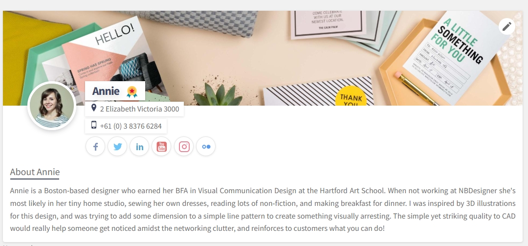
Marketplace and Template UX for Fast Design Start
Browsing design templates from gallery or marketplace
The Printcart Design Marketplace gives users access to a library of pre-designed templates categorized by product type. These templates act as springboards, letting customers personalize layouts without starting from scratch.
Templates can be sorted and browsed via:
Product page galleries (linked to each SKU)
Marketplace navigation (global gallery across all products)
Designer profile pages (for multi-vendor setups)
Shops can control visibility, group templates by tag, and pre-load the most popular options.
Using categories, flatlist, and filters for usability
Usability improves significantly when templates are well organized. Printcart allows the use of:
Flatlist views for fast grid-based browsing
Category trees (e.g., Events > Wedding, Events > Birthday)
Search filters for color, layout orientation, and tags
Consider labeling templates with callouts like “Editable Name Only” or “Upload Your Photo Here” to help users select the right one.
Visual consistency between template and design tool
To maintain trust and avoid cognitive dissonance, the transition between template gallery and the Online Designer must be seamless.
Tips to ensure visual consistency:
Use matching thumbnails and live previews
Maintain color schemes between storefront and editor
Automatically highlight editable fields once the editor loads
Preload product specs and disable unrelated features for locked templates
You can explore template demo flows on the Printcart Design Gallery and Designer Profile Pages.
Next, we’ll move into best practices for branding the Online Designer to match your store and reinforce brand trust.
Branding the Online Designer for Trust and Continuity
Adding your logo inside the design editor
A consistent visual identity builds trust and familiarity. Printcart allows you to insert your store logo directly inside the Online Designer—reinforcing that customers are still within your brand ecosystem.
You can place the logo in:
The top left corner of the editor toolbar
The design launcher screen before the canvas opens
Loading animations or tooltips for a subtle brand presence
Set this under PC Designer > Appearance > Layout Branding.
Color palette branding and default font settings
Aligning the editor’s look and feel with your storefront improves trust and reduces friction. Printcart allows you to set a custom color scheme and font pack to match your brand.
Editable settings include:
Primary and accent colors (toolbar, highlights, call-to-action buttons)
Default font for text layers (headers, paragraphs)
Button and icon style to match WooCommerce or Shopify themes
Configure branding under:
PC Designer > Appearance > Theme Settings or use custom CSS overrides via shortcode placement.
UI microinteractions that reinforce your brand identity
Beyond static visuals, subtle microinteractions enhance emotional engagement:
Hover animations using your brand’s motion style
Tooltips in your tone of voice (“Click to make it yours!”)
Confirmation dialogs with your store mascot or themed icon
Custom success screens ("Great job! Your mug is ready to print")
These details turn a basic customization into a branded, memorable experience.
To implement advanced branding techniques, refer to the Printcart UI Customization Guide.
Next, we’ll explore real-world UX walkthroughs for common product types like business cards, t-shirts, and packaging.
UX Walkthroughs for Common Product Types
Business card personalization with editable fields and safe zones
Business cards are among the most common print products, and users expect quick, professional results. A good UX setup includes:
Preloaded templates with locked brand elements (e.g., logo, layout)
Editable text fields for name, title, contact info
Visible safe zones and trim lines to avoid cutoff errors
Inline field labels like “Enter Your Name Here”
Keep the UI minimal—disable unnecessary tools like clipart or shape libraries.
T-shirt design UX with front/back sides and live preview
For apparel, especially t-shirts, users expect creativity and flexibility. Ideal settings:
Toggle buttons for Front, Back, and Sleeve views
Image upload zones with scaling and centering tools
Real-time mockup preview or 3D view to display fabric and fit
Layer locking to prevent accidental shifts while editing
Use tap-friendly zones and high-contrast controls for mobile-first shoppers.
Packaging design with custom shapes and grid alignment
Packaging products—like boxes, labels, and wraps—require precise design handling. Recommended UX tools include:
Grid snapping and ruler guides to align artwork with fold lines
Support for CMYK, SVG, and dieline overlays
Locked elements for fixed positions (e.g., nutrition panels)
Custom canvas sizes mapped to product dimensions
Enable DPI validation and warn users about resolution issues when uploading logos.
Each of these flows can be previewed in action on the Printcart Product Demos page.
Next, we’ll move into a comprehensive checklist of UX and UI settings to enable across your store for optimal performance.
Online Product Designer UX/UI Checklist
Must-enable UI features for smoother design experiences
To deliver the best possible customization experience with the Printcart Online Designer, ensure the following UI features are turned on and tested across devices and product types:
Live preview toggle: Enables instant updates as users type or move objects
Safe zone and bleed line display: Critical for print accuracy, especially for business cards and packaging
Grid + ruler visibility: Helps align elements and reinforces control in structured designs
DPI validation alerts: Warn users when images fall below acceptable print resolution
Layer locking: Prevents accidental movement of background or template elements
Mobile responsiveness: Auto-adjusts canvas and UI components for smartphones and tablets
Device optimization: desktop vs mobile
Make sure your designer is responsive to the user's device context:
Mobile: Enable auto-collapsing sidebars, sticky CTA buttons, and large tap targets
Tablet: Use swipeable side tabs and floating toolbars
Desktop: Maximize screen real estate with expandable canvas, floating palettes, and full tool access
Test across real devices and use analytics to track usage patterns (Google Analytics or Hotjar).
Editor simplification strategies by product type
Tailor your editor’s complexity to the design needs of each product:
To activate or configure these UI settings, visit the Printcart Appearance and Layout Settings Panel.
Next, we’ll wrap up with a summary of why great UX matters and how to get started with Printcart today.
Conclusion: Building a Better Online Design Experience
Why UX is the key to reducing support tickets and boosting conversions
User experience is not just about aesthetics—it directly impacts your store’s revenue, support load, and customer retention. A well-designed online product designer:
Encourages users to complete their customization journey
Reduces pre- and post-sale support requests
Minimizes design errors and order rejections
Enhances trust, especially for first-time buyers
Summary: What makes a great Online Designer UX?
Tailored layouts: Choose Modern, Classic, or Visual modes based on product type
Simplified interfaces: Hide unnecessary tools for beginners, show advanced tools for B2B
Smart defaults: Use editable fields, preloaded templates, and mobile-first flows
Clarity: Provide tooltips, bleed/safe zones, and resolution validation
Continuity: Match your brand’s look and voice in every screen of the editor
Every element—button placement, editor tab visibility, or DPI warning—plays a role in making your store feel usable, trustworthy, and professional.
Get started with Printcart Online Designer today
If you're not yet using Printcart, the easiest way to test the full experience is to try the live demos or install the plugin on your staging store:
Explore the Designer Demo
Install Printcart Plugin for WooCommerce
Already using Printcart? Revisit your editor configurations with this tutorial as a checklist. You can:
Adjust layout settings
Hide or show editor tabs
Improve mobile design flows
Add custom branding and UI polish
For more help, visit the Printcart Online Designer Setup Guide or contact your account manager for a 1-on-1 UX audit.
Great UX doesn’t just make designing easier—it turns visitors into buyers.
Netbase
This quote has stayed with me throughout my journey—especially as I built Printcart from the ground up.
I'm David, CEO of Printcart, a division of Netbase JSC, and I’ve dedicated the past 15 years to transforming the Web-to-Print and Print-on-Demand (POD) industry. My goal from the beginning has been clear: to help printing businesses around the world scale through automation, personalization, and smart technology.
Before Printcart, I spent years consulting and launching web-to-print platforms for printers of all sizes—from local shops to global enterprises. That experience taught me to ask the right questions:
How can we reduce manual steps for printers and let them focus on growth?
What tools do customers need to personalize and place their orders effortlessly?
How can we make the Web2Print journey smoother, faster, and more profitable?
At Printcart, we combine AI, cloud-based automation, and a plug-and-play customization engine to bring that vision to life. But more than features, we care about outcomes—helping our clients deliver better user experiences, close more deals, and scale sustainably.
I’m always open to new ideas and feedback from the community. If you’re exploring how to evolve your print business or launch a new eCommerce venture with Web2Print capabilities, feel free to connect directly.
Let’s talk growth.
? Email: project@printcart.com
? Website: https://printcart.com